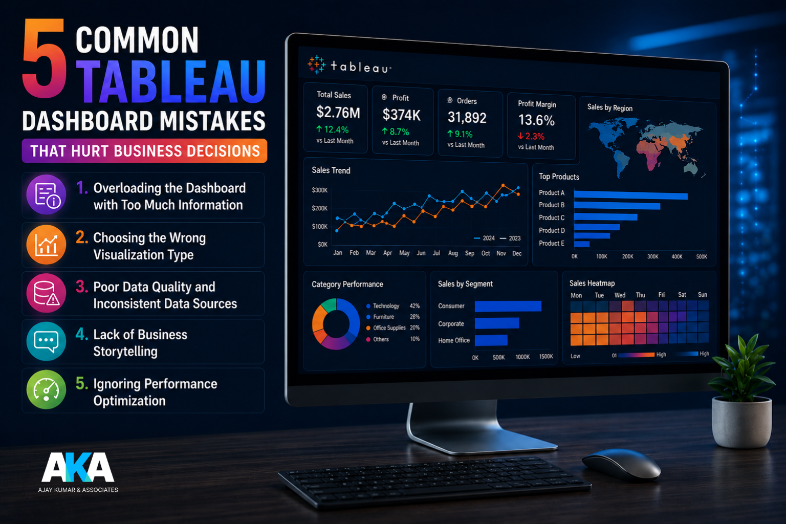
5 Common Tableau Dashboard Mistakes That Hurt Business Decisions
In today’s data-driven business environment, dashboards are no longer
just reporting tools — they are strategic decision-making assets. Tableau has
emerged as one of the most powerful business intelligence platforms for
transforming raw data into actionable insights. However, even the most advanced
dashboards can fail if they are not designed properly.
At Ajaykumar and Associates (AKA), we often see businesses invest
in Tableau dashboards but struggle to derive meaningful outcomes because of
avoidable design and data mistakes. A poorly built dashboard can lead to
incorrect interpretations, delayed decisions, and missed opportunities.
Here are five common Tableau dashboard mistakes that can negatively
impact business decisions, along with best practices to avoid them.
1. Overloading the
Dashboard with Too Much Information
One of the most common Tableau dashboard mistakes is trying to include
too much data on a single screen.
Businesses often believe that more charts, more KPIs, and more filters
automatically make a dashboard more useful. In reality, this creates confusion
and makes it difficult for decision-makers to focus on what truly matters.
For example, a CFO reviewing a finance dashboard needs clear visibility
into:
- revenue trends
- cost analysis
- variance reporting
- cash flow insights
If the dashboard is cluttered with unnecessary graphs and metrics,
critical insights may get lost.
Best Practice:
Focus on clarity and business relevance. Every chart and KPI
should directly support a decision.
A good Tableau dashboard should answer a business question, not
overwhelm the user.
2. Choosing the
Wrong Visualization Type
Using the wrong chart type is another major issue in Tableau dashboard
design.
For instance:
- pie charts for large datasets
- line charts for non-time-based comparisons
- overly complex scatter plots for simple trends
These visualization mistakes can distort the story behind the data.
A wrong visual may cause management to misread performance trends,
leading to poor strategic decisions.
Example:
Using a pie chart to compare 15 expense categories makes it difficult to
identify major cost drivers.
A horizontal bar chart would communicate the same insight much more
effectively.
Best Practice:
Use chart types based on the purpose:
- bar charts for comparisons
- line charts for trends
- heat maps for performance intensity
- scatter plots for correlation
Following Tableau dashboard best practices improves decision quality
significantly.
3. Poor Data
Quality and Inconsistent Data Sources
Even the best dashboard design fails if the underlying data is
inaccurate.
This is one of the most dangerous Tableau reporting issues businesses
face.
Common problems include:
- duplicate records
- outdated data refreshes
- inconsistent master data
- incorrect joins
- manual Excel dependencies
A dashboard built on poor-quality data leads to poor-quality decisions.
For example, if sales data from one region is not updated, leadership
may assume a decline and make unnecessary corrective actions.
Best Practice:
Ensure:
- automated data pipelines
- proper ETL validation
- regular data reconciliation
- controlled source systems
At AKA, our Tableau consulting services focus heavily on data
governance and validation before dashboard deployment.
4. Lack of Business
Storytelling
A dashboard should do more than display numbers.
It should tell a story.
Many businesses make the mistake of building dashboards from a technical
perspective rather than a business perspective.
Users should immediately understand:
- what changed
- why it changed
- what action is required
Without this narrative flow, dashboards become static reports instead of
strategic tools.
Example:
Instead of simply showing:
Revenue = ₹5 Cr
The dashboard should provide context:
- revenue growth %
- target variance
- top-performing regions
- month-over-month trend
This transforms raw numbers into decision-ready intelligence.
Best Practice:
Design dashboards around decision workflows.
Ask:
“What action should the user take after seeing this insight?”
This is where professional Tableau analytics consulting creates
maximum value.
5. Ignoring
Performance Optimization
Slow dashboards are one of the biggest frustrations for business users.
If Tableau dashboards take too long to load, executives stop using them.
Common causes:
- large unoptimized datasets
- excessive filters
- too many worksheets
- poor calculations
- unnecessary live connections
A dashboard that takes 20–30 seconds to load can significantly affect
business adoption.
Best Practice:
Optimize:
- extracts instead of live connections where possible
- reduce worksheet dependencies
- simplify calculations
- limit unnecessary filters
A fast dashboard improves user engagement and decision speed.
Turn Tableau Dashboards into Insight-Driven
Business Tools with AKA
Tableau is a powerful platform, but dashboard success depends on
thoughtful design, clean data, and business-focused storytelling.
Avoiding these common Tableau dashboard mistakes can dramatically
improve the way your business makes decisions.
At Ajaykumar and Associates (AKA), we help organizations build optimized,
decision-driven Tableau dashboards that improve reporting accuracy,
executive visibility, and operational performance.
If your dashboards are not delivering the insights you need, our Tableau
consulting and analytics services can help transform them into strategic
business tools.